Capacity Report
Resource usage analysis (CPU, memory and disk) of the tenant hosts, with classification into four categories to support capacity planning. Instead of showing raw charts, the report summarizes each host on one row and tells whether it is healthy, near the limit, overloaded or idle.
It is the screen that answers questions like "which host am I going to have to upgrade next quarter?", "is there spare capacity I can consolidate?" and "which server is suffering right now and needs action?". Unlike the Cockpit, which shows current state, the Capacity Report works with period averages (default: last 7 days) to give a stable reading of the load.
Who uses it
- Infrastructure teams run the report at month end or quarter end to decide what to upgrade and what to consolidate.
- Technical leadership looks at the overall classification to justify (or push back on) requests for new machines.
- Sales and onboarding teams identify idle hosts on freshly onboarded customers, to propose consolidation or cost reduction.
- On-call uses the Over Utilized classification as a second signal: when a host shows up here, it has been running hot for a sustained period, not just a one-off spike.
How to open
From the menu Observe & Explore → Reports → Capacity Report. Direct URL is /reports/capacity.
The screen
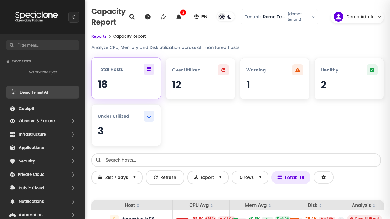
The screen has four vertical blocks:
- Header with period selector, Refresh and Export buttons.
- Report Settings & Classification: panel where you tweak the limits for each category and open the How it works explainer.
- Current / Compare toggle: defines whether you are looking at the current period alone or comparing with the previous one.
- 5 KPI cards at the top followed by the host table, which is the heart of the report.
How the calculation works
For every eligible host in the tenant, the report collects the CPU, memory and disk averages for the chosen period. The averages are compared against the levels defined in Customize Thresholds (or the platform defaults), producing a per-resource classification. The final host category is the worst of the three.
The explanation shows up in summary form on the How it works link next to the report title. Worth opening that link the first time you present the report to someone: saves a lot of questions.
Hosts without complete data
Hosts without collection for one of the three resources (for example, a network device that does not expose disk metrics) enter the report considering only the available resources. They show -- on the missing resource column.
Header and filters
Above everything sit the global report controls:
- Period: dropdown with Last 7 days as default. Other options are last 24 hours, last 30 days and custom range.
- Refresh: forces a recompute of the report with the latest data. Equivalent to reloading the page, but without losing filters and customizations.
- Export: generates CSV, Excel or PDF of the host table with the current filters and classification.
The 7-day default is intentional
Smaller windows (1 day) suffer from one-off spikes and tend to inflate the Over Utilized category. Larger windows (30 days) smooth things out too much and can hide a recent degradation. Seven days is the balance most teams use for planning.
Report Settings & Classification
The Report Settings & Classification block summarizes how each host is being classified. It brings:
- How it works: link that opens a textual explanation of the classification logic. Useful to show someone seeing the report for the first time.
- Customize Thresholds: button that opens the tuning panel (see below).
- Customized: badge that appears next to the report title when the thresholds have been changed from the defaults. Visual reminder that the reading is not the platform default.
Customize Thresholds
By default, the platform brings sensible values for most environments. When you open Customize Thresholds, you see the CPU, memory and disk levels that separate each category. For example:
| Category | Typical CPU average range |
|---|---|
| Under Utilized | below 20% |
| Healthy | between 20% and 70% |
| Warning | between 70% and 85% |
| Over Utilized | above 85% |
The numbers are editable per individual host or for the whole report. The general rule: the host category is determined by the worst of the three resources (CPU, memory, disk). A server with healthy CPU but disk at 95% lands as Over Utilized.
The Reset defaults button restores factory levels and removes the Customized badge.
Customization is per user, not per tenant
When you tweak a threshold, the change applies only to your session. Other tenant users keep seeing the report with the default thresholds. If you want the whole team to use a custom standard, agree on the values and each person applies on their side, or use Export to distribute the already adjusted snapshot.
Current vs Compare toggle
Right above the KPIs sits the Current / Compare toggle.
- Current: shows only the period chosen in the header (for example, last 7 days).
- Compare: splits the screen into two columns and places the current and the previous period side by side (for example, this week vs the previous one). Each KPI now has two values and an arrow indicating whether the metric improved or worsened.
Comparison is mostly useful in two situations:
- Validate an action: you upgraded a host last week. In Compare, it should go from Over Utilized to Healthy.
- Detect regression: a host that was Healthy turned into Warning with no obvious change. Worth investigating what grew (load, new deploy, log retention).
The 5 KPIs at the top
The top cards give the macro reading of the tenant:
| KPI | What it shows | Typical action |
|---|---|---|
| Total Hosts | How many hosts entered the report (considering filters). | Reference. |
| Over Utilized | Hosts above the limit in at least one of the three resources. | Immediate action: upgrade, rebalance or investigate. |
| Warning | Hosts close to the limit. They have not crossed yet, but the margin is thin. | Watch carefully and plan. |
| Healthy | Hosts within the good range across all resources. | No action needed. |
| Under Utilized | Idle hosts, with low usage of all three resources. | Candidates for downsizing or consolidation. |
The sum of the last four categories equals Total Hosts when no filters are applied, because every host falls into exactly one category.
The host table
Below the KPIs, the table breaks down each host. The columns are:
| Column | Content |
|---|---|
| Host | Host name. Click to open the host detail. |
| CPU Avg | Average CPU percentage in the period. |
| Mem Avg | Average memory percentage in the period. |
| Disk | Disk usage percentage in the period (typically the peak of the window, because disk does not oscillate like CPU). |
| Analysis | Host classification: Healthy, Warning, Over Utilized or Under Utilized. |
| Status | Color indicator that visually mirrors the Analysis (green, yellow, red, gray). |
The CPU Avg and Mem Avg columns may bring sub-columns with extra detail (peak, min, deviation) depending on the available space. The base data is always the period average.
Sort by Analysis to focus on what matters
Default sort is alphabetical by host. Click the Analysis column header to group everything Over Utilized at the top. That view is the one that helps most in capacity meetings.
CPU and Memory sub-columns
On wide screens, CPU Avg and Mem Avg expand into sub-columns with:
- Avg: the main value used for classification.
- Peak: the highest point observed within the period. Helps to understand whether the 50% average hides a 95% spike.
- Min: the lowest value observed. Big gaps between min and peak indicate oscillating load (likely batch jobs or seasonal spikes).
The classification always uses the average, never the peak. A host with 40% average and 90% peak is Healthy according to the report, even if the peak deserves separate investigation (open the host detail for that).
How to read the Analysis
The classification combines CPU, memory and disk. The rule of thumb: worst wins. Examples:
- CPU 30% + Mem 40% + Disk 90% → Over Utilized (disk crossed).
- CPU 75% + Mem 60% + Disk 50% → Warning (CPU in the yellow band).
- CPU 15% + Mem 18% + Disk 22% → Under Utilized (all three low).
- CPU 45% + Mem 50% + Disk 60% → Healthy.
When thresholds are customized, the bands change and the same numbers may fall into a different category. That is why the Customized badge exists: you always know whether you are reading the platform ruler or yours.
Use cases
Quarterly planning
Open the report at the end of the quarter, 30-day period, sort by Analysis. The Over Utilized + Warning combination will come on top. Those are the upgrade candidates for the next cycle. Under Utilized goes to the consolidation or downsizing discussion. The total count tells you the size of the fleet.
New customer onboarding
Newly onboarded customers usually bring a fleet sized by another vendor, under different load. Run the report on the first 30 days of operation, identify Under Utilized hosts and use that list as the base for an honest commercial conversation: consolidate machines, reduce instance size, or simply confirm that sizing is correct.
Capacity alert
When the Over Utilized card shows a number that grew from one week to another (visible in Compare), open the table, focus on the hosts in that category and investigate. It might be a new deploy, a memory leak, log retention blowing up disk. Whatever it is, the action is immediate: alarm, ticket, emergency upgrade.
Justify cost reduction
In cost reduction conversations, Under Utilized is the best argument. Export the filtered table and bring numbers to the meeting: "these N hosts stayed below 20% on all three resources for 30 days straight". Hard to argue with.
Monthly capacity audit
Some organizations adopt the report as a monthly ritual: on the first Monday of the month, someone from the infra team opens the report with a 30-day period, exports the PDF and attaches it to the operations meeting minutes. As months go by, the sequence of PDFs becomes a history that shows fleet evolution without relying on memory or side spreadsheets.
Combine with the SLA Report
A host that is Over Utilized and also shows low SLA in the SLA Report is double priority: it is suffering and it is hurting availability. That is the kind of host that justifies an immediate upgrade, not next quarter.
Export
The Export button opens the options:
- CSV: raw file, easy to drop into a spreadsheet or process with a script.
- Excel: pre-formatted spreadsheet, with colored header and the classification highlighted.
- PDF: report with header, KPIs and formatted table. Good to attach to tickets, share via email or bring to meetings without needing a screen.
The export respects current filters and customizations: period, custom thresholds and mode (Current or Compare). The Customized badge also shows up on the PDF to make clear that snapshot is not the platform default.
Snapshot, not a live link
The export freezes the report state at the moment of the click. It does not update if you open the PDF tomorrow. To track evolution, redo the export or schedule a recurring send (on the roadmap; check with the product team).
Frequently asked questions
Does the report consider business hours or a 24/7 window? The average is always computed on a 24/7 window inside the chosen period. Hosts that stay idle at night but saturated during the day tend to appear as Healthy or Warning, masking the daytime stress. If that is a concern, narrow the period to 24 hours and run at peak time, or open the host detail to see the curve.
Why do two hosts with the same numbers appear in different categories? Almost always because one of them has custom limits via host variables. Check the Variables card on the configuration of the suspect host.
What happens with hosts created during the period? They enter the report with the average of the days they existed. A host created 3 days ago inside a 7-day period is classified based on those 3 days. Worth considering that smaller sample before deciding on it.
Can I filter the table by tag? Today filtering is by total. For group analysis (tags, monitoring profile), export to CSV and filter on the spreadsheet. Native tag filtering is on the roadmap.
Best practices
A few habits mature teams adopt with the report:
- Standardize the team period. Agree whether the ruler is 7 days or 30 days and stay consistent. Swapping windows every meeting makes month-over-month comparison hard.
- Document custom thresholds. If the team decided that Warning starts at 65% (not 70%), record that somewhere accessible. Otherwise, in 3 months nobody remembers why the number is different.
- Do not confuse Healthy with healthy. A Healthy host on the report meets the average usage criteria, but may still have latency, packet loss or other problems the report does not see.
- Use weekly comparison in operations meetings. Showing the difference between this week and the previous one usually yields better insights than looking at an absolute number.
Known limitations
- Three resources only: CPU, memory and disk. Network, IOPS and other metrics do not enter the classification. If a host is saturating the network, it may show as Healthy here despite having a problem.
- Disk is per host, not per filesystem: the report aggregates host-level disk usage. A host with
/at 30% and/var/logat 99% might appear as Healthy depending on how the collector aggregated. For per-filesystem analysis, open the host detail. - Paused hosts are excluded: hosts with Status: inactive on the configuration are ignored.
- Maximum 90-day window: for longer windows, export and compare spreadsheets.
Next steps
-
SLA Report
Availability, downtime and breakdown by host and by system.
-
Recurring Alerts Report
Top alerts that fire the most: identify chronic problems before they become incidents.