Widgets and data sources
This is the densest page in My Dashboards. Here you find the full catalog of widget types available in the editor, the four data sources that feed those widgets and the detail of every tab of the configuration panel.
If you have not opened the editor yet, start with Creating and editing. For a general understanding of what a dashboard is on the platform, see Concepts.
Overview
The palette on the left side of the editor brings 15 widget types, organized in 4 categories. Each widget renders data from a data source, which can be a host metric, an application metric (APM), a custom wildcard query or the current state of an alert.
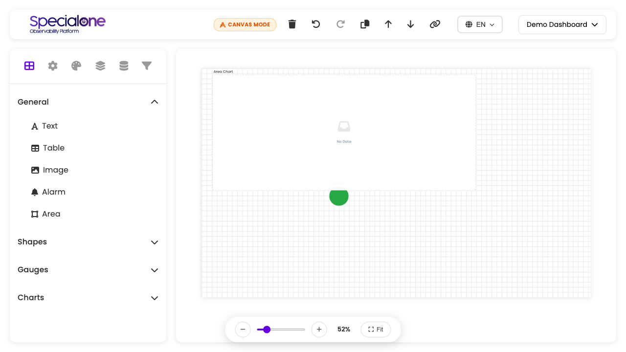
You pick the widget type first, then the data source: drag the right type (gauge, line chart, table) onto the canvas and then configure which metrics it will show.
| Category | What goes in | When to pick |
|---|---|---|
| General | Text, Table, Image, Alarm, Area | General content, annotations, listings, visual indicators. |
| Shapes | Circle, Rectangle | Decorative elements to organize the canvas visually. |
| Gauges | Gauge, Linear Gauge | Show a single aggregated value on a scale. |
| Charts | Area, Bar, Column, Line, Donut, Pie charts | Time series or proportions across multiple values. |
Full catalog
The table below lists the 15 types with default size (in grid units) and the typical situation where each one makes sense. Sizes are initial values: you can resize freely on the canvas.
| Widget | Category | Default size | When to use |
|---|---|---|---|
| Text | General | ~6×3 | Free-form annotations on the dashboard. Does not consume data. Useful for section titles, comments on how to read the panel, links to other places. |
| Table | General | ~12×8 | Tabular history of readings, with multiple rows and columns. Accepts top X filters, pagination and visible column selectors. |
| Image | General | ~6×6 | Embed of a static image: customer logo, architecture diagram, physical rack map. Accepts upload or URL. |
| Alarm | General | ~3×3 | Binary visual indicator of an alert state. Renders in green (OK) or red (PROBLEM) and can blink while the alert is open. |
| Area | General | ~10×8 | Alternative area chart, rendered without a header. Use when the widget is the entire content of a block and the title adds nothing. |
| Circle | Shapes | proportional | Decorative circular shape. Does not consume data. Useful to draw visual attention or compose with other widgets. |
| Rectangle | Shapes | ~6×4 | Colored background under a group of widgets. Combine with background color to create visual zones on the canvas. |
| Gauge | Gauges | ~6×8 | Circular gauge 0-100% or in a defined range. Good for a single metric: main server disk usage, cluster average CPU rate. |
| Linear Gauge | Gauges | ~8×5 | Horizontal progress bar. Same idea as the gauge, in a more compact format, fits well in rows. |
| Area Chart | Charts | ~10×8 | Time series with the area below the line filled. Good for accumulated volume (total traffic, requests per minute). |
| Bar Chart | Charts | ~8×8 | Horizontal bars. Useful when the category axis has long labels (hostnames, alert descriptions). |
| Column Chart | Charts | ~8×8 | Vertical bars. More natural when the category axis is discrete time (weekdays, hours of day). |
| Line Chart | Charts | ~10×8 | Classic time series with one or more lines. Standard for CPU, memory, latency, error rate over time. |
| Donut Chart | Charts | ~6×8 | Ring showing the proportion between categories. Same function as the pie chart, with room in the center for a total number. |
| Pie Chart | Charts | ~6×8 | Slices with proportion between categories. Use with few categories (up to 5-6). |
Text and Image do not consume data
The Text, Image, Circle and Rectangle widgets are purely visual. They do not hit any data source, do not count against performance limits and render instantly. Use freely to structure and contextualize the dashboard.
Data sources
Every widget that consumes data (all of them except the four decorative ones above) pulls from one of the four data sources available in the editor.
Host metric
The most used source. You select one or more hosts monitored by the platform and then pick which metrics from those hosts the widget will show.
Configuration:
- In the Metrics tab of the right panel, click Selected Hosts.
- Check one or several hosts from the list. Searching by name helps in large environments.
- In Metrics, pick which metrics from those hosts the widget will use.
The host input accepts wildcards and lists:
prod-*brings every host whose name starts withprod-.srv-01,srv-02brings only the two cited hosts.*db*brings any host withdbin the name.
Practical example: line chart with CPU for the last 30 days of three specific database servers (db-master,db-replica-1,db-replica-2). Each host becomes a series on the same chart line.
Where the metrics come from
The metrics available on each host are defined by the monitoring profiles applied to it. If a metric you expect does not appear in the list, confirm in Infrastructure → Hosts → (host) → Configuration → Collected Metrics whether it is active on that host.
APM metric (application)
Comes from the application observability layer (APM). Instead of measuring a host, it measures the behavior of an observed service: response time, error rate, throughput.
Typical APM metric examples:
response_time(average latency or percentiles).error_rate(percentage of failed requests).throughput(requests per minute).apdex(satisfaction index).
Configuration:
- In the Metrics tab, switch the source to APM.
- Select the monitored APM service.
- Pick the metric and the period.
Useful for application health dashboards: one page per critical service, with latency, errors and throughput side by side.
Custom query
A search pattern (wildcard) resolved in real time, scanning every metric in the tenant that matches the pattern. Useful when you do not know the specific host or want comparisons.
Configuration:
- In the Metrics tab, pick the Custom Query source (or Custom Metrics).
- In Metrics pattern, write the wildcard pattern.
- The widget renders every tenant metric that matches.
Pattern examples:
system.cpu.*returns every CPU metric of every host in the tenant.*.disk.freebrings disk free space from any host.nginx.requests.*brings any nginx metric, aggregated by host.
Wide queries are heavy
Very open patterns (*.*, *) scan the entire tenant on every widget render. In tenants with hundreds of hosts this impacts dashboard load time. Restrict the pattern as much as you can and prefer extra filters by tag or grouping.
Alert state
Pulls the current status of a specific alert. It is the source typically used by the Alarm widget, but it works on other indicator widgets too.
Configuration:
- In the Metrics tab, pick the Alert source.
- Search the alert by name or filter by Severity and Alert Tag (format
key:value, e.g.app:web). - Select the alert from the list.
The widget shows OK (green) or PROBLEM (red) based on the real-time state of the alert. Combine with Color Thresholds (see below) to customize the hues.
Detailed widget configuration
The right panel of the editor brings several tabs. Which ones appear depends on the selected widget type. The most common appear in almost all of them:
General tab
Defines the widget identity.
- Name: internal name, used to identify the widget in logs and exports. Does not appear in the final render.
- Title: what appears in the widget header when rendered. Can include host variables (see further below) to parameterize.
Name vs Title
Use a descriptive Name (cpu-prod-db-master) so you can find yourself later and a more readable Title (CPU - main database) for whoever reads the dashboard.
Metrics tab
The densest tab. Defines what the widget shows.
- Metric aggregation: how to combine multiple values. Typical options:
- Sum All: sums the values of every selected source into a single number/series.
- Average: averages them.
- Maximum: keeps the highest.
- Summed Metric Label: when aggregating, defines the name of the result.
- Selected Hosts and Metrics: detailed in the Data sources section above.
- Top X filter: limits the widget to the top or bottom N values. Available in tables and charts.
- Hosts source: Hardcoded (list embedded in the widget) or Dashboard filter (pulled from the dashboard global filter, parameterizing the widget).
Table Settings tab
Specific to the Table widget. Controls the tabular presentation:
- Rows per page: internal pagination.
- Top X filter: shows only the top N (Highest values) or bottom N (Lowest values).
- Show count: displays a row counter at the bottom.
Chart Settings tab
Appears in every chart. Controls the visual presentation:
- Legend: on/off, position (top, bottom, side).
- Scale: linear or logarithmic. Use log for metrics with very wide magnitude variation.
- Colors: default palette or custom per series.
Time Range tab
Defines the period the widget queries.
- Fixed period: uses a determined range independent of the dashboard (
Last 1 hour,Last 24 hours,Last 7 days, etc). - Custom range: sets specific Start Date/Time and End Date/Time.
- Inherits from dashboard: the widget follows the dashboard global period selector. Recommended default for most widgets, keeps the dashboard cohesive.
When to pin a widget period
On executive-oriented dashboards it makes sense to pin some widgets to specific windows (e.g. "last month comparison" always 30d, "alerts now" always 1h) while others follow the global selector. Mix with judgment.
Color Settings tab
Defines the widget chromatic look and the rule for color change by value.
- Default color: base color used when no threshold is crossed.
- Color Thresholds: table of
value → colorrules that switch the widget color according to the rendered data. - Groups: groups series by criterion (host, metric) and assigns a different palette to each group.
Background tab
- Background color: solid color behind the widget.
- Background image: image occupying the widget background (upload or URL). Useful for watermarks, floor plan maps, rack photos.
- Choose Image and Remove Background: manage the upload.
Grid tab
- Grid color: color of the widget internal grid line (visible in charts and tables).
Filters tab
- Custom filters (local filters): controls the dashboard user can toggle at runtime to filter only this widget. Good for drill-down without affecting the others.
- Global filters: created on the canvas (outside the widget) and referenced by the widget. Detailed in the Filters and variables section.
Color thresholds in detail
The color-change-by-value rule is one of the most useful editor features. It lets the widget talk to the reader visually without needing to read the number.
How it works:
- In the Color Settings tab, click Add Threshold.
- Set a
cutoff value → colorpair. Example:70 → yellow. - Repeat for other cutoff points. Example:
90 → red. - The default color (green) applies below the first threshold.
The widget renders in the color matching the highest threshold crossed by the current value.
Classic CPU gauge example:
| Range | Color |
|---|---|
| 0% to 70% | Green (default color) |
| 70% to 90% | Yellow (threshold 1) |
| Above 90% | Red (threshold 2) |
The same pattern applies to Linear Gauge, Charts (changing the series or individual bar color when the threshold is crossed) and even to Alarm (with custom colors for OK and PROBLEM).
Thresholds and alerts are distinct things
Color thresholds are purely visual: they do not fire notifications nor log anything to the audit trail. To actually react to a critical value, configure an alert in the Configured Alerts sub-tab of the host. Widget thresholds only help dashboard reading.
Filters and variables
Three different mechanisms let you parameterize what the dashboard shows. Knowing which to use saves a lot of rework.
Global filters
Appear on the canvas, outside the widgets, usually on top of the dashboard. Controlled at runtime by the viewing user, they affect every widget on the dashboard at once.
Example: application health dashboard with a global filter by environment (prod, staging, dev). Switching the filter reloads every widget pulling the hosts of that environment.
Configuration: in the Filters tab of the right panel, with the canvas selected (no widget), click Add Filter. Define name, type (host, tag, metric) and possible values.
Custom filters (per widget)
Appear inside each widget as toggles the user can switch at runtime. They affect only that widget.
Example: API error chart with a toggle between 5xx and 4xx. Does not change the rest of the dashboard.
Configuration: in the Filters tab of the widget, under Custom filters, click Add Filter.
Host variables
Key-value pairs configured on the host itself (in Configuration → CI Configuration → Variables). They are meant to parameterize alert thresholds without cloning the alert, but they can also be referenced in the widget so the title or the metric varies by host.
Reference example: widget title with CPU - ${HOST_LABEL}. When the dashboard loads with a filter for a specific host, the HOST_LABEL variable from that host is substituted.
| When to use | Mechanism |
|---|---|
| Filter the whole dashboard at once | Global filter |
| Drill-down on a single widget | Custom filter |
| Parameterize title, description or metric per host | Host variable |
Performance and gotchas
Knowing how the dashboard performs at runtime avoids surprises.
- Each widget = 1 request to the backend. A dashboard with 50 widgets fires 50 parallel requests on every refresh. On widgets with heavy sources (wide custom queries, hosts with many metrics), total time grows quickly.
- 60s timeout per widget. When a source takes longer than that, the widget renders an error state but does not freeze the whole dashboard. Other widgets keep loading.
- In-memory cache helps. The platform keeps the last query result cached for a few seconds. Reloading the dashboard reuses this cache. Switching browser tabs too. But the cache is lost when you close the tab or force refresh with the green button.
- Aggressive auto-refresh multiplies load. A dashboard with 50 widgets on 1-minute auto-refresh makes 50 requests per minute, 3000 per hour. On 24/7 wall displays, consider a more spaced interval.
Focused dashboards perform better than monster dashboards
The temptation to pile everything in a single dashboard is big, and the platform does not block it. But dashboards with more than 30 widgets become slow to load, hard to read and expensive to maintain. The practice that works best is having multiple focused dashboards (5-15 widgets each), one per theme (database, network, application X), and using tags or favorites to switch between them.
Kill duplicate widgets before creating new ones
Before adding more widgets, review the existing ones. Often an existing chart covers the new need if you adjust aggregation or filters. Editing is cheaper (in performance and maintenance) than multiplying similar widgets.
Next steps
-
Creating and editing
How to open the Dashboard Designer, choose visibility, set global filters and save.
-
Share and view
View mode, automatic refresh, time range and sharing rules between users.
-
Back to My Dashboards
List, search, filters and actions of the main dashboards page.