Recurring Alerts Report
Identifies the alerts that fired the most in the period, ranked by count. This is the right report to attack chronic problems: instead of answering the same alert over and over, you see which ones keep coming back and go after the root cause.
The logic is simple: if the same alert definition went into problem state 200 times in the last 30 days, either there is something wrong in the environment that needs to be fixed once and for all, or the alert threshold is too sensitive and is generating noise. Either way, it is worth acting on.
Who uses it
- On-call operators check the most frequent alerts of the night first thing in the morning, to prioritize what to tackle first.
- Continuous improvement teams run the report at every month end and use the Top 10 as the meeting agenda.
- Infrastructure managers identify problematic hosts by looking at the Affected Hosts column: if the same host appears across several top alerts, it is asking for attention.
- Monitoring profile owners spot noisy rules (very high count with low severity) to tune thresholds or silence them.
How to open it
From the menu Observe & Explore → Reports → Recurring Alerts Report.
The direct URL is /reports/recurring-alerts.
Page structure
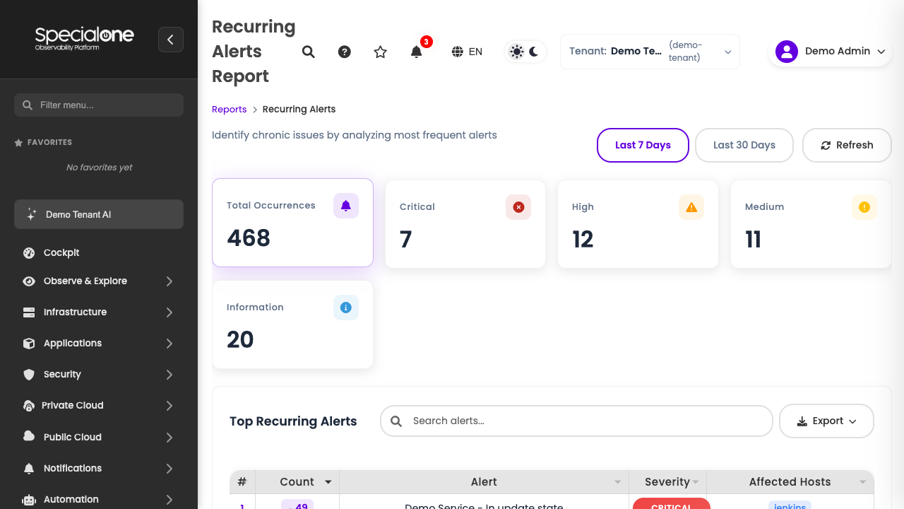
The page is built in three layers, top to bottom:
Period selector
Toggle at the top with two fixed options:
- Last 7 Days: tactical view, good to follow the week or to spot a recent degradation.
- Last 30 Days: strategic view, good for continuous improvement meetings and trends.
When you switch the toggle, every KPI and the table reload. There is no custom range on this screen: the goal is to keep the report direct. For custom windows, use Alerts History and filter manually.
KPIs at the top
Just below the toggle sit five cards:
| Card | What it shows |
|---|---|
| Total Occurrences | Sum of all alert firings in the period (larger KPI, highlight). |
| Critical | How many firings were of Critical severity. |
| High | How many were of High severity. |
| Medium | How many were of Medium severity. |
| Information | How many were of Information severity. |
Each severity KPI has its own color (red for Critical, orange for High, yellow for Medium, blue for Information), following the platform standard palette.
The read is fast: if Critical represents 5% of the total but the absolute count goes over 50, you have a serious recurring problem. If Information is 80% of the total, there is too much noise and rules need a review.
Top Recurring Alerts block
Below the KPIs, the ranking table. This is the heart of the report.
The table
| Column | Content |
|---|---|
| # | Position in the ranking (1, 2, 3...). The alert with the most firings sits at the top. |
| Count | How many times the alert fired in the period. Includes repetitions even if it is still open. |
| Alert | Alert description (the same text that appears in Problem Description in Alerts History). |
| Severity | Color badge with the alert severity (Critical, High, Medium, Information). |
| Affected Hosts | List of hosts where the alert fired in the period. If the same alert affected 12 hosts, all of them appear here. |
Drill-down
Click any row in the table to open Alerts History already filtered by the selected alert. From there you see every individual firing: when it started, when it ended, on which host, how long it was open.
This is the normal investigation path: you spot the alert in the top, click and navigate to the detailed history.
Auxiliary controls
On the page header you have:
- Refresh: forces a data reload (useful if you tweaked alerts or profiles and want to see the effect right away).
- Export: dropdown with CSV, Excel and PDF. Useful to attach in presentations or to share the ranking with people who do not have platform access.
There is no host, severity or tag filter on this screen: the goal is to look at the whole picture. For finer slices, export and filter in the destination tool, or move to Alerts History.
How to read it
The default reading follows three simple rules:
Top 10 of the month deserves investigation
The first ten in the Last 30 Days ranking are, by definition, what consumes the most team attention. Even if each looks small individually, together they dominate the operations queue. Bringing this list to the continuous improvement meeting is already half the work.
High severity + high count: top priority
When a Critical or High alert shows up in the top with a large count, that is where you attack first. Something important is going wrong repeatedly, and there is no excuse to leave it running.
Low severity + very high count: noisy alert
The opposite case is the most common. An Information or Medium alert with 500 firings in the month is not an emergency, it is noise. Two ways out:
- Tune the threshold so it only fires when it really matters.
- Silence it via maintenance or disable it in the monitoring profile, if the metric lost its purpose.
Before silencing, understand why it fires
Reducing noise without understanding the reason creates blind spots. Look at a few individual firings in Alerts History before silencing: the frequency might be revealing a real problem that nobody has formalized yet.
Use cases
Continuous improvement meeting
Take last month's Top 10 (toggle on Last 30 Days), export as PDF and bring it as the meeting agenda. For each item:
- Discuss the root cause.
- Assign an owner to attack the #1.
- Define a goal: "next month, this alert drops by at least 50%".
Next month, open the same report and compare. The drop of the top items is the direct measure of the initiative's impact.
Identify a problematic host
Look at the Affected Hosts column across the first 20 rows. If the same host (srv-app-03, for example) shows up in 6 distinct alerts at the top, that host is the bottleneck: it might have degraded hardware, be overloaded, misconfigured or at end of life.
The typical action is to open the host detail in Hosts and review everything: CPU, memory, disk usage, processes, logs and configuration.
Tune noisy thresholds
An alert fires 200 times in 30 days with Information severity. That is not monitoring, that is spam. Open the alert in the monitoring profile that originated it and:
- Raise the threshold (e.g., CPU > 80% for 5 minutes instead of > 70% for 1 minute).
- Add a dependency on another alert to suppress redundant notices.
- Lower the severity even further, if it makes sense.
The next run of the report tells you whether the tuning stuck.
Investigate a recent degradation
Compare Last 7 Days with Last 30 Days. If an alert appears at the top of the 7-day view but was much lower in the 30-day view, something changed this week: deploy, configuration change, capacity issue, external attack. Investigate what happened on the transition.
Next steps
-
Alerts History
Detail firing by firing. This is where the table drill-down takes you.
-
SLA Report
Availability and downtime for monitored systems, with export by system/technology.
-
Capacity Report
Hosts under utilized, healthy, warning and over utilized across CPU, memory and disk.