Creating and Editing Dashboards
Creating a brand new dashboard and tweaking an existing one happen in the same place: the visual editor of My Dashboards. This page covers both flows end to end, from clicking New Dashboard to the Save that takes you back to the list.
The list page (under Observe & Explore → My Dashboards) is the starting point. The editor opens on its own screen, at /dashboard-edit.html?id=X, outside the regular app layout. That is where you drag widgets, configure metrics, set colors and pick the time range.
Where each thing lives
The editor is only for building and adjusting. View mode (/dashboard_view?id=X) is what the rest of the tenant sees once the dashboard is ready. Both share the same widgets, but the editor shows the grid, the palette and the properties panel; view mode only renders the result. Sharing and publishing are handled on the next sub-page.
Creating a new dashboard
The starting point is the New Dashboard button on the top right corner of the My Dashboards list. It opens a small modal with one required field.
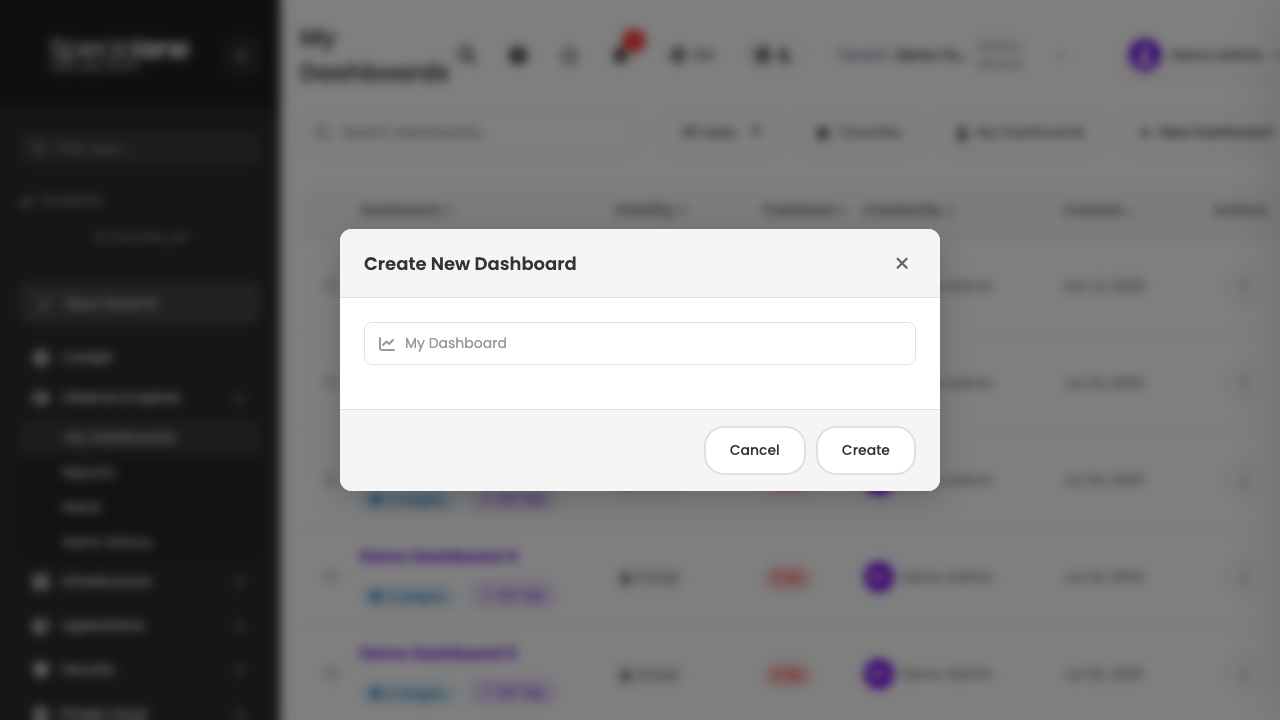
The Create New Dashboard modal asks for the New Dashboard Name. The placeholder suggests "My Dashboard", but replace it with something that describes the purpose of the panel: Online Store Operations, Production Database Health, Executive KPIs are good examples. This name is what shows up in the list, in the browser tab and at the top of the view page.
Confirm with Create Dashboard. The modal closes and the editor opens straight on the new dashboard, with an empty canvas and the widget palette on the left.
Initial visibility
By default, every new dashboard starts as Private: only you can see it. Switching to Organization, Shared or Public happens later, on view mode or from the list actions menu. See Sharing and viewing.
You can still rename the dashboard later (click the name on top of the editor, or the title on view mode). Picking a good name at creation saves confusion in the list later on.
The visual editor
The editor is a screen of its own, with three columns side by side. Each one has a specific role.
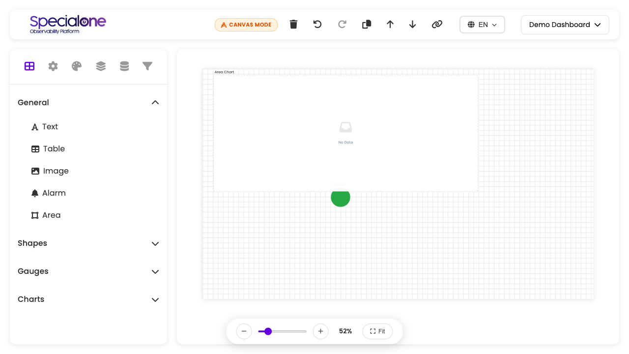
| Column | Role |
|---|---|
| Widget palette (left) | Catalog of available widgets grouped in categories. Click adds to the canvas. |
| Canvas (center) | Work area. Grid system where widgets sit. |
| Properties panel (right) | Configuration for the selected widget or for the dashboard as a whole, with tabs for General, Metrics, Time, Colors, Background, Grid and Filters. |
Editor header
The top bar of the editor has:
- Dashboard name (clickable, edits inline).
- Canvas indicator showing you are on the main editing screen.
- Save: writes the current state to the server.
- Preview: opens the dashboard in view mode on a new tab without leaving the editor.
- Back: returns to the My Dashboards list. If there are unsaved changes, the browser warns you first.
Grid system
The canvas uses a 24-column grid with free height. When you drag or resize a widget, it snaps to the closest grid cell. That avoids loose pixels and keeps similar widgets aligned.
Each grid unit is proportional to the screen width. On wide screens, 24 columns yield comfortable widgets; on narrow screens, widgets stay snapped but shrink. The minimum size per widget is 2×2 grid units.
Think in blocks of 6 or 8 columns
For a layout that breathes, plan widgets as clean fractions of 24: rows with four 6-wide widgets, three 8-wide, two 12-wide. Mixing odd sizes (5, 7, 9) tends to leave visual gaps on the grid.
The widget palette
The left palette groups available widgets into four categories:
General
| Widget | What it is for |
|---|---|
| Text | Title, sub-title, instruction or any free text block. Supports simple formatting and works as a label for dashboard sections. |
| Table | List of metric or alert items, with configurable columns and internal pagination. |
| Image | Static image (customer logo, floor plan, topology diagram). Cropped and adjusted in configuration. |
| Alarm | Real-time alerts panel filtered by the criteria you choose (severity, tags, hosts). |
| Area | Background shape to group widgets visually. No data behind it, only drawing. |
Shapes
Widgets with no data, used as decoration or visual separators:
- Circle
- Rectangle
Combine with the Area widget to create zones on the dashboard (for example, a light gray background rectangle wrapping all database charts).
Gauges
| Widget | Best for |
|---|---|
| Gauge | Single value with a circular scale. Good for bounded indicators (CPU usage, disk fill). |
| Linear Gauge | Same idea on a horizontal or vertical bar. Saves space when you need several side by side. |
Charts
| Widget | When to use |
|---|---|
| Area Chart | Filled time series. Good for accumulated volume. |
| Line Chart | Simple time series. Default for trend of technical metrics. |
| Bar Chart | Horizontal bars. Category comparison when the label is long. |
| Column Chart | Vertical bars. Category comparison when the label fits horizontally. |
| Pie Chart | Distribution of parts of a whole. Use for up to 5 categories. |
| Donut Chart | Pie with a hole in the middle. Same rule, but leaves space for a big number in the center. |
Add and remove
Click on a widget in the palette to add it to the canvas, with default size and on the first available spot. To remove a widget, select it on the canvas and press Delete, or click the trash icon that appears when the widget is selected.
Widget starts empty
Adding a widget is just the first step. With no metric configured, the chart shows blank and the table reads "no data". Data source configuration happens on the Metrics tab of the right panel. See the dedicated sub-page Widgets in detail.
Dragging and resizing widgets
Once the widget is on the canvas, two basic moves:
- Move: drag by the widget header (the top bar where the title shows). The cursor becomes the grab hand and you can place it anywhere on the grid. On release, the widget snaps to the closest cell.
- Resize: drag by the corners of the widget. Width and height change in grid-unit increments. The minimum is 2×2.
Widgets may visually overlap during the drag, but on release the editor repositions if needed to avoid collision. If you want two widgets exactly aligned, place one first, then use its column or row as reference for the second.
Edit several similar widgets by copying
To repeat a chart with a similar data source: configure the first, then add a new one of the same type from the palette and copy the settings (metric, time range, colors). Save before each block so you do not lose work.
Properties panel
The right column changes its content based on what is selected. If no widget is selected, it shows the whole dashboard properties (background, grid, global filters). If a widget is selected, it shows that widget's properties.
Available tabs vary by widget type, but the full set is:
General tab
- Name: internal widget identifier (useful to reference in global filters).
- Title: text shown on the widget top bar in view mode. Leave empty for a widget with no visible title.
Example use: Name is "cpu_prod_db", Title is "Average CPU - Production Database".
Metrics tab
The densest tab. This is where you define where the data comes from for the widget. Includes:
- Host selection (hardcoded source, typed list or dashboard filter).
- Metrics pattern (wildcard, e.g.
Status*matches every metric starting with Status). - Aggregation (sum all, average, max) when the widget shows a single value.
- Custom metrics for specific cases.
Because the content of this tab varies a lot per widget type and is what brings the dashboard to life, it has a dedicated sub-page with each combination: Widgets in detail.
Table Settings or Chart Settings tab
Appears only for table and chart widgets:
- Rows per Page (table): 10, 20, 25, 50.
- Top X Filter (table): show highest values or lowest values, with adjustable count.
- Chart Settings (charts): legend, axes, number format.
Time Range tab
Defines the period the widget queries. The predefined options are:
| Option | Description |
|---|---|
| Last 1 hour | Default for most new widgets. |
| Last 3 hours | Good to investigate a morning incident that drags into early afternoon. |
| Last 6 hours | Covers half a shift. |
| Last 12 hours | Default for full-shift dashboards. |
| Last 24 hours | Full day view. |
| Custom range | Start and end date/time typed manually. |
Each widget can have its own time range or inherit the dashboard time range (set on view mode, on the dashboard header). By default, the widget inherits from the dashboard. If you pin a range on the widget, it ignores the dashboard choice.
When to pin the range on the widget
Pin only on widgets that always need to show the same period regardless of user choice. For example, a "Current Month SLA" widget should show the month even if the user switches the dashboard to "Last 1 hour". For everything else, let the widget inherit.
Color Settings tab
- Default Color: base color the widget uses when no threshold is hit. Accepts hex (
#3B82F6) or visual picker. - Color Thresholds: ranges of value with different colors. Useful on gauges and on numeric values. Example: up to 70% green, 70 to 90% yellow, above 90% red.
Thresholds are organized in Groups when the widget has multiple series. Each group gets its own thresholds, and each threshold has a min value, a max value and an associated color.
Background tab
Applied to the whole dashboard, not to a single widget:
- Background Color: solid color behind the canvas.
- Background Image: upload an image that becomes the background plane. Good for dashboards with a decorative backdrop (floor plan, diagram). After uploading, use Crop Image, Rotate Left/Right, Fit and Reset to frame it.
- Remove Background: removes the image and returns to a neutral background.
Grid tab
Also applied to the whole dashboard:
- Grid Color: color of the guide lines that show only on the editor. On view mode the grid disappears, but the chosen color helps whoever is building see the alignment better.
Global Filters tab
Filters that affect every widget on the dashboard at once. Example: a global host filter prod-* makes every widget consider only hosts whose name starts with prod-. Useful on multi-customer dashboards, where the same structure is reused by swapping only the filter.
There are also Custom Filters: filters the user can toggle in the widget on view mode. You define the list of options in the editor, and the viewer uses a dropdown to switch.
Dashboard time range
The time range of the whole dashboard is decided in view mode, in the header (Last 1 hour, 3 hours, 6 hours, 12 hours, 24 hours, 7 to 30 days, custom range). Here in the editor you can preview that range by picking on the right panel, but the user's final choice happens in view mode.
Each widget can:
- Inherit from the dashboard (default): the user-picked range applies.
- Have a fixed range: the widget always shows that period, regardless of user choice.
The per-widget choice is made on the Time Range tab of the properties panel when the widget is selected.
Saving
The Save button on the editor header writes the current state to the server. Saving is manual: until you click Save, your changes live only on the browser. If you close the tab without saving, you lose everything (the browser warns first).
No concurrent editing control
Today the editor has no versioning and no concurrent-edit detection. If two people open the same dashboard in the editor at the same time, whoever clicks Save last overwrites the first. Agree beforehand with the team on who is editing, or edit at different times. For heavily used shared dashboards, consider duplicating and working on the copy.
After saving, the editor stays open and you can keep editing. To leave for good, use Back on the header (goes to /my_dashboards) or Preview (opens view mode on a new tab).
What gets saved
- Position and size of each widget.
- Configuration of each widget (metrics, time range, colors, etc).
- Dashboard properties (background, grid, global filters).
- Dashboard name.
What is not saved by the editor Save
- Visibility (Private, Organization, Shared, Public): changed on view mode, through the share configuration menu.
- Dashboard tags: edited from the Edit Tags button on the list row.
- Published status: managed outside the editor.
Editing an existing dashboard
To open an existing dashboard in the editor, you have two paths:
From the list
- Go to Observe & Explore → My Dashboards.
- Find the dashboard on the list.
- On the three-dot menu of the row, pick Edit Dashboard.
From view mode
- Open the dashboard on view mode (
/dashboard_view?id=X). - On the header, click Edit.
Both paths open the editor with the dashboard's current state, with the canvas, palette and properties panel as expected.
Permissions to edit
| Who you are | What you can edit |
|---|---|
| Owner (creator) | Everything: content, name, visibility, sharing, publication, tags, deletion. |
| Shared with you | Only the content (widgets, layout, metrics, colors). Cannot change visibility or add/remove sharing. |
| Tenant collaborator | Same level as Shared user on dashboards visible at the organization. |
| Viewer (Public) | Can only view, no Edit button. |
If the Edit button does not show up, you do not have permission. Ask the owner to add you to sharing, or to duplicate the dashboard and pass you a copy.
History of who edited
There is no detailed log of who edited what. The list shows Created By (original author) and the creation date, but does not track subsequent edits. For large teams, agree on naming conventions or use tags like owner:douglas to make it clear.
Next steps
-
Widgets in detail
Each widget type has its own data source options, aggregation and formatting. See the complete reference.
-
Sharing and viewing
Visibility, publication, view mode and auto-refresh of the finished dashboard.
-
My Dashboards list
Back to the list with search, filters, favorites and tags of the tenant's dashboards.