APM
The APM (Application Performance Monitoring) page is where the team sees, in real time, how production applications are behaving: how long each transaction takes, how many are failing, which services are slow and how they depend on each other.
The idea is straightforward. Infrastructure monitoring answers "is the server up?", APM answers "is the application serving customers well?". You see service by service the response time, throughput and error rate, then drill down when something looks off, ideally before the customer calls.
Accessed from Applications → APM.
Who uses it
Three personas usually live on this page:
- Developers: watch latency and errors on the services they own, drill into specific transactions to understand why an endpoint got worse after a deploy.
- SRE and on-call: use the service map to understand cascading impact when something breaks, and open the detail to correlate with alerts and hosts.
- Technical managers: follow long-term trends (week, month) and compare with previous periods to measure the impact of changes.
APM requires application instrumentation
Unlike hosts, which can be monitored via agent without touching code, APM requires an instrumentation agent embedded in the application. The step by step lives on the Setup guide.
The service list
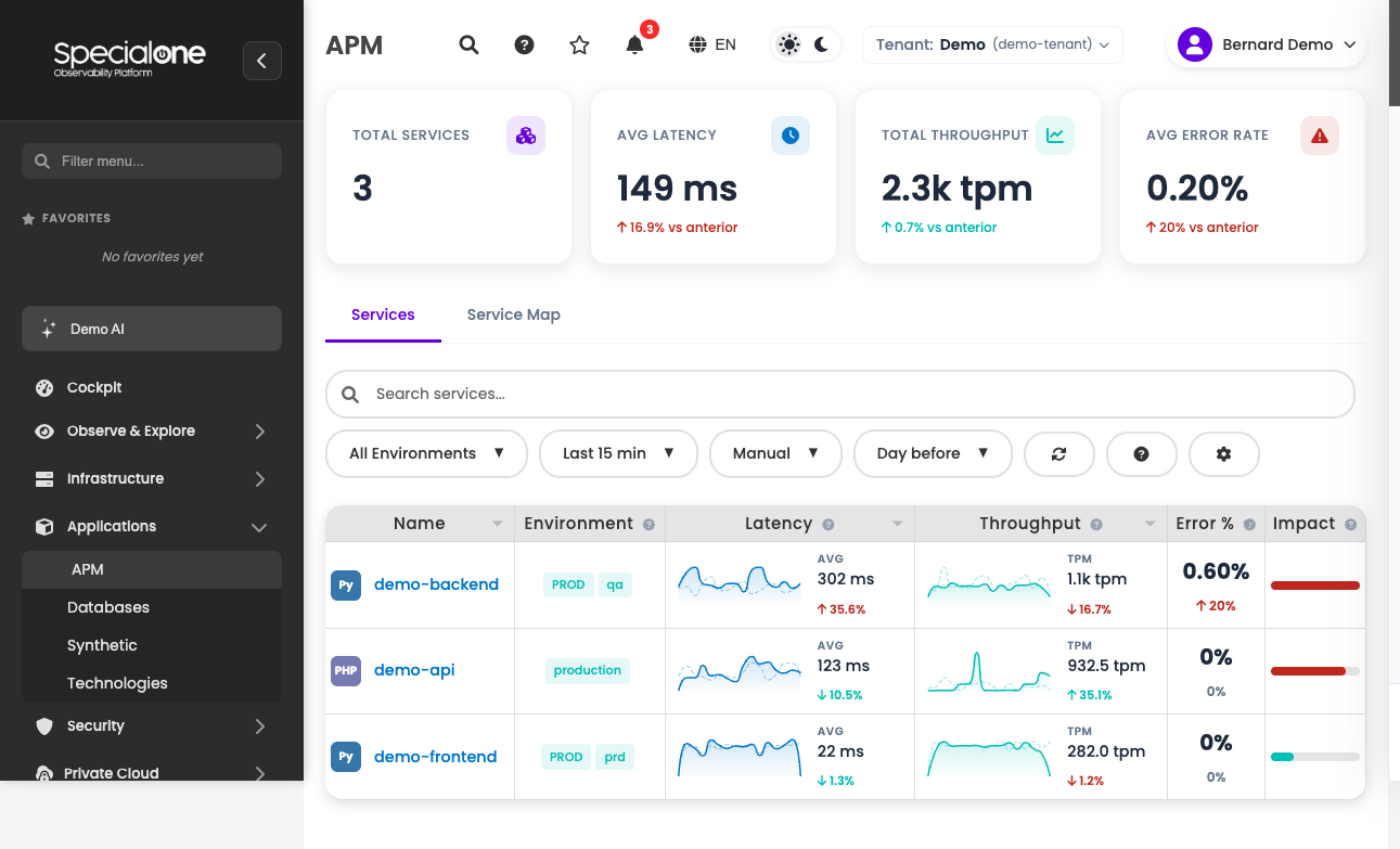
The Services tab is the starting point. Each row represents one service of the application (a microservice, a worker, a frontend, an API). The columns, all sortable:
| Column | Content |
|---|---|
| Name | Service name as the APM agent reports it (e.g. api-checkout, worker-emails, frontend-web). Click to open the detail. |
| Environment | Which environment the service is running in (production, staging, homolog, etc). Comes from the agent. |
| Latency (ms) | Average response time over the selected time window. Sparkline on the side shows the trend. |
| Throughput | Transactions per minute. Sparkline follows along. |
| Errors (%) | Percentage of transactions that failed. Sparkline highlights spikes. |
| Impact | Severity indicator of the current state (combination of high latency, error rate and missing data). |
Each row carries a colored state indicator:
- Green: healthy service.
- Orange: degraded, error rate above 5% or latency elevated against baseline.
- Red: in trouble, error rate above 20% or completely missing transaction data.
- Gray: no data in the last 24 hours, agent down or never reported in that window.
Sort by impact for fast triage
When something feels off but you do not know where, sorting by Impact descending puts the worst offenders on top. It is the APM equivalent of Critical on the Alerts page.
KPIs on top
Above the list sit four cards with the tenant-wide summary:
| Card | What it shows |
|---|---|
| Online services | How many are healthy (green) in the current window. |
| Degraded services | How many are orange. |
| Services with errors | How many are red or gray. |
| Average latency | Weighted average of latency across all active services. |
The cards act as an opening thermometer: glance, see if there is fire, then drill into the table.
Controls and filters
The control bar above the table governs what shows up and how it updates.
Time window
Presets available in the period picker:
- Last 15 min (default): short window, great for the "right now" during an incident.
- Last 1 hour: zoomed into a recent period, useful post-deploy.
- Last 24 hours: day view.
- Last 7 days: weekly trend.
- Custom: pick start and end yourself.
The 15-minute default was chosen because APM shines during incidents: you want to see what is happening now, not the historical average. For trend analysis, switch to 24h or 7d.
Auto-refresh
A dropdown next to the period controls automatic refresh:
- Manual: you click Refresh when you want.
- 30s / 1min / 5min: the screen reloads on the selected interval.
On a NOC wall or during an incident, 30s is the sweet spot. For surgical investigation on one service, prefer Manual to avoid sparkline redraws while you stare at them.
Comparison
Another dropdown lets you compare the current window with a previous period:
- None (default): only the current window.
- Previous day: overlays the same window 24h earlier.
- Previous week: overlays the same window 7 days earlier.
The comparison shows up as a dashed line on sparklines and as percentage variation values. Useful to answer "is 800ms latency high or normal for this time of day?".
Environment filter
The All Environments dropdown lists the environments detected by the agent. Selecting production hides everything from staging and dev. In tenants with several active environments, this filter saves a lot of noise.
Search
A free-form field filters the list by service name. Search is incremental (filters as you type).
Refresh
The Refresh button forces a reload, ignoring the auto-refresh interval. Used when you want to see the immediate effect of a deploy or change.
Setup guide
A link in the top corner takes you to /apm/setup, the instrumentation instructions page. Use it when someone asks "how do I turn APM on for my new service?".
Manage allowed services
Not every service the agent reports needs to show up in the list. The Manage services button opens a modal where you define the tenant allowlist: which service names enter the view.
The modal shows:
- The current list of allowed services.
- A field to add a new name (usually pasted from what the agent reported).
- A remove button on each row.
Why this exists: in shared tenants or during transition (stack migration), the agent may report test services, old instances or duplicate names. The allowlist keeps the screen clean without touching the agent.
The allowlist filters the UI, not collection
Data keeps flowing into the platform APM backend. Removing from the allowlist only hides from the list and the map. To stop collecting for real, uninstrument the application or turn the agent off.
Service map
The Service Map tab shows the system topology as a graph. Each node is a service, each edge is a call between them (HTTP, RPC, queue, database).
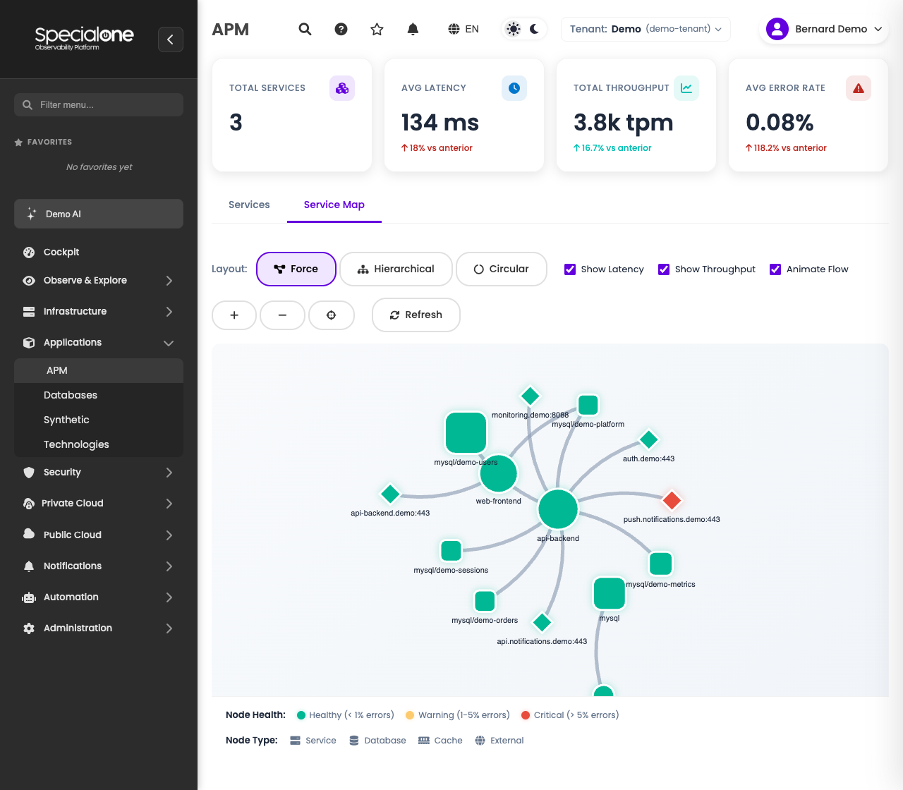
The map inherits the same color states as the list: green, orange, red, gray. That lets you glance and see where the problem is spreading. A red api-checkout with five orange downstream services tells a clear story: the failure is at checkout, but it ripples through the chain.
Click any node to open the detail of that service.
The edge between two nodes shows the call rate and the average latency of that specific interaction. In systems with many services, this is where "forgotten" dependencies surface (someone wired a new worker into the critical database without telling anyone).
Use the map before opening the detail
During incident investigation, start at the map, not at the table. The map shows cascading impact that the table hides: in seconds you see that five services are orange because service A is red.
Service detail
Clicking a service in the table or on the map opens the detail page (/apm/services/<name>). It is organized in tabs that go from the big picture down to code:
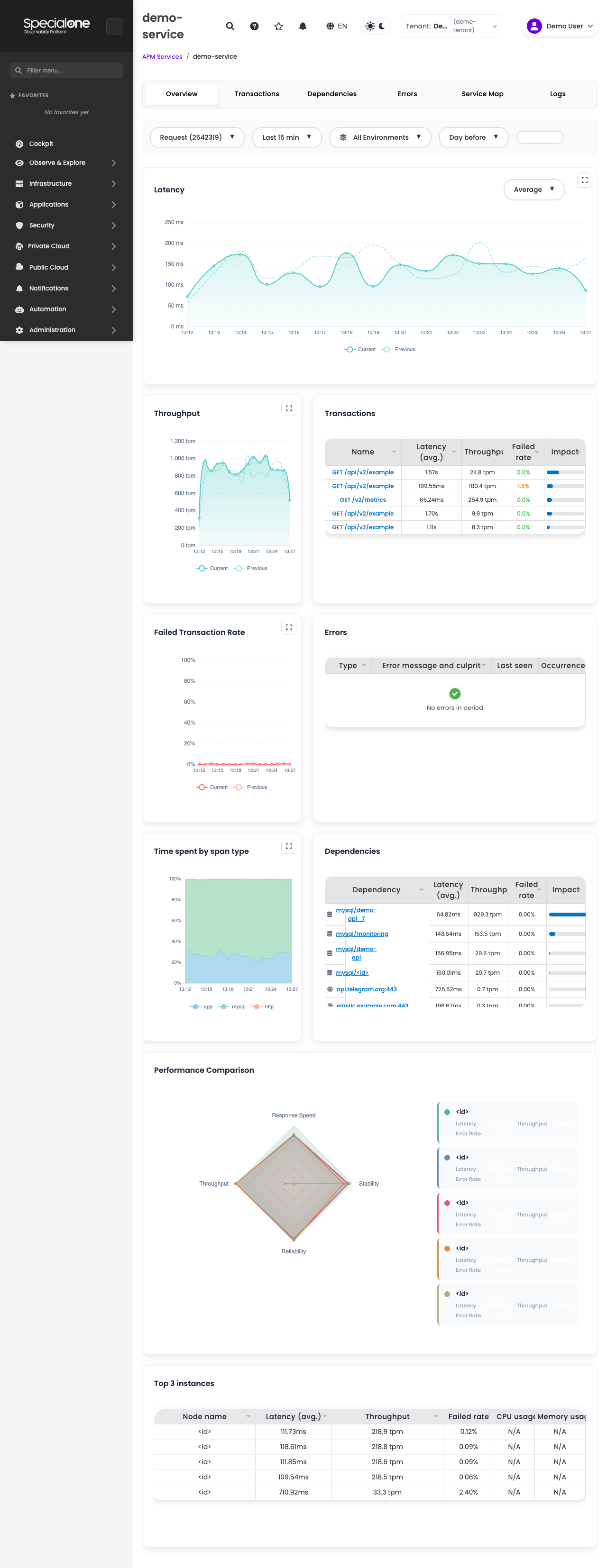
- Overview: service KPIs (latency, throughput, error rate) with time series and top transactions.
- Transactions: list of transactions with latency and error per transaction. Click to drill into the transaction detail (
/apm/services/<name>/transactions/<t>), where individual sample traces appear. - Dependencies: services and external resources called by this one (other services, databases, queues, APIs).
- Errors: grouping of recent errors. Each row opens a detail page (
/apm/services/<name>/errors/<id>) with stack trace and context. - Metrics: extra technical metrics (process CPU/memory, GC, connection pool), when the agent collects them.
- Service Map: same map visualization, but centered on this service.
- Logs: integration with the service logs when configured.
- Alerts: alerts currently open and related to the service.
Typical drill-down flow: list, detail (overview), specific transaction or error, trace or stack trace, root cause.
Empty state and setup
On a brand new tenant, or while no agent has reported a metric yet, the page shows empty with setup instructions in three steps:
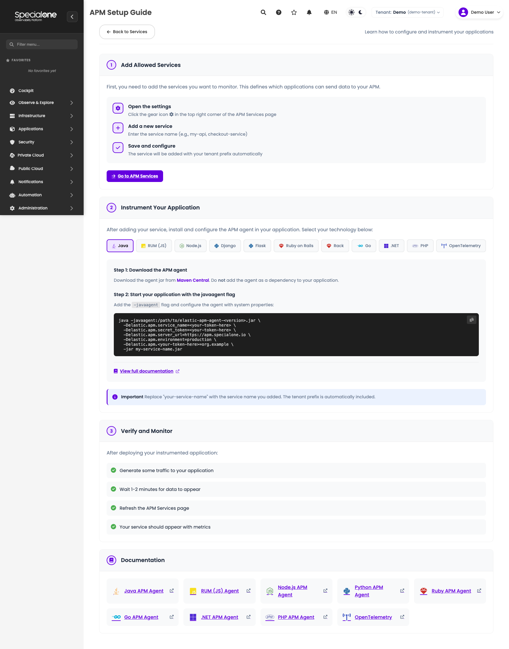
- Install the agent for the application language (each language has a specific package).
- Configure credentials with the tenant token so the agent knows where to send telemetry.
- Restart the application and wait a few minutes for the first data.
The full step-by-step, with snippets per language, lives at /apm/setup (Setup guide link on the top bar). Once data starts coming in, the page automatically swaps the empty state for the regular list.
No data for more than 24h shows as gray
If a service that used to be green flips to gray, suspect first a stopped agent, a broken deploy or an expired credential. Gray means "no metric arrived in that window", not "everything is fine".
Limits
A few useful numbers to size usage:
- Pagination: defaults to 10 rows per page. On tenants with a few dozen services, bumping to 25 or 50 helps avoid constant paging.
- Performance: the page is tuned for up to about 100 active services per tenant. Above that, load time grows and sparklines may lag. Use the allowlist to keep only the relevant services visible.
- Sparklines: each mini-chart shows up to about 500 points. Long windows with many samples get automatic aggregation to fit.
- Timeout: queries to the platform APM backend time out at 60 seconds. Very long windows or tenants with high volume can hit it; the screen will show an error and you will need to shorten the interval or add more filters.
Next steps
-
Alerts
Set up alerts on top of APM metrics (latency, errors) to be notified proactively.
-
Dashboard widgets
Use APM metrics in widgets on your own dashboards.
-
Hosts
Cross-reference APM with the health of the host where the application runs.