Cockpit
The landing page you see right after signing in. It packs the overall state of your tenant on one page: health by category, environment numbers, recent alerts, busiest hosts and trends over the last month.
The point is to answer in seconds: is the environment healthy right now? If not, what is hurting?
Overall health
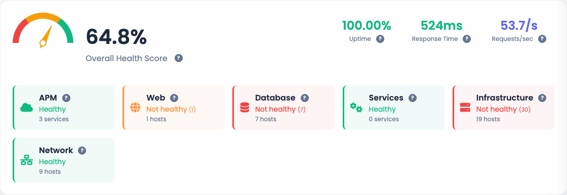
The top block concentrates the quick read:
- Overall Health Score (gauge on the left) sums up the environment state on a 0 to 100% scale. It drops when there are open critical alerts or degraded services.
- Uptime, Response Time, Requests/sec on the right come from the APM layer and reflect what is measured on the tenant's application services.
- Per-category cards (APM, Web, Database, Services, Infrastructure, Network) show in green what is healthy and in red what has open alerts. The number in parentheses is the count of active alerts in that category.
Every card is a shortcut: clicking takes you straight to the alerts list filtered by the category.
Start with the red card
On a morning triage, scan the row of cards. Anything red is an entry point for investigation. If everything is green, you usually do not need to open anything else.
Environment Overview

Four counters that answer "how much do I have":
| KPI | What it counts |
|---|---|
| Configuration Items | Monitored hosts in the tenant. |
| Monitoring Points | Sum of active items across all hosts. |
| Configured Alerts | Total active alerts. |
| APM Services | Applications observed by the APM layer. |
These numbers are a baseline to track environment growth. Sudden jumps or drops usually mean new collection coming in, a profile applied at scale or a downed agent.
Technical and Business Metrics
Right below sit two blocks side by side:
- Technical Metrics: Uptime, Average Response Time, Requests/sec, Total Services, Active Alerts.
- Business Metrics: Conversion Rate, Average Ticket, Total TPV, MRR.
Business metrics only make sense for tenants with custom APM plugged into transactional data. If your tenant does not use that, the block shows zeros or is hidden.
Services Overview
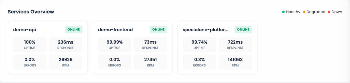
Lists the APM services active in the tenant with four key metrics per card:
- Uptime (%) accumulated.
- Response time average.
- Errors percentage.
- RPM (requests per minute).
The status bar at the top of each service (green / yellow / red) reflects the combined reading of these metrics. Use this block to answer "is any application misbehaving right now?".
Top Servers by Resource Consumption
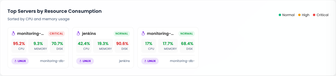
Shows the hosts with the heaviest CPU and memory load. Each card has:
- Host name with status (Normal, High, Critical).
- CPU, Memory and Disk in percentage.
- Operating system tag.
Best place to find "which server is suffering right now" without opening the hosts page. Hosts in Critical come first.
Alerts History
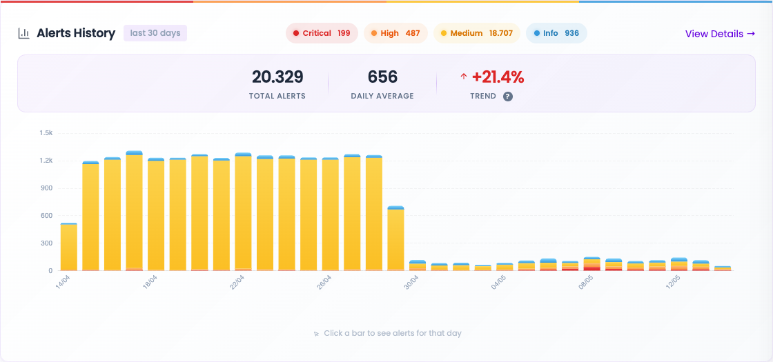
View of the last 30 days with:
- Totals per severity (Critical, High, Medium, Information).
- Total alerts accumulated and daily average.
- Trend compared against the previous month (green = decreasing, red = increasing).
- Bar chart per day (click a bar to open that day's alerts).
Good for spotting degradation trends: if the trend climbs week over week, something is consistently getting worse.
Top Recurring Alerts
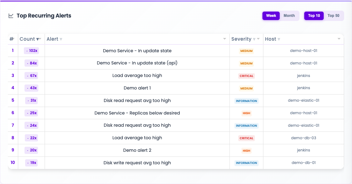
Table with the alerts that fired the most in the selected window. The default is the current week, top 10. Filters:
- Week / Month: changes the window.
- Top 10 / Top 50: changes the list depth.
Each row brings the count, the alert name, severity and host. Use this view to detect the noisy alert: the one that fires dozens of times in a row with no one tending to it. It is usually a candidate to:
- Tune the alert rule (threshold, time window).
- Schedule a maintenance on the window the firing is expected.
- Review the notification rule in case it is hitting the wrong channel.
Recent Alerts
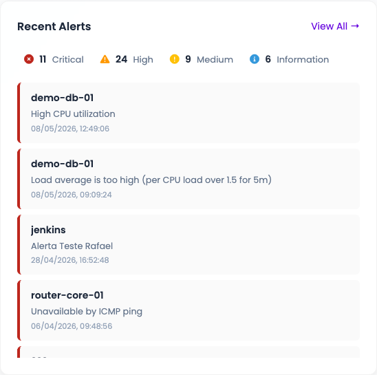
Chronological list of the most recent alerts, with severity counters on top. Each row shows host, message and time.
Difference versus History: this one is the "what just happened" feed, including alerts that may already be resolved. Useful to confirm that an incident a user reported actually showed up in monitoring.
Top Alerts
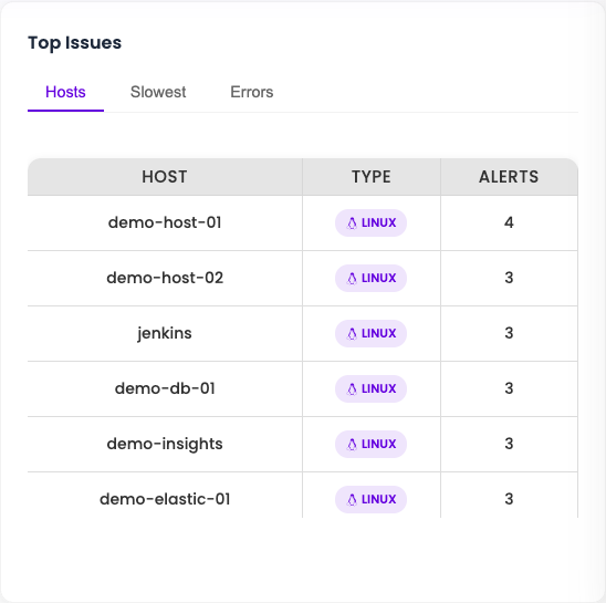
Table of hosts with most open alerts, with filters:
- Hosts: ranks by alert count.
- Slowest: ranks by service latency.
- Errors: ranks by error rate.
Best place to answer "which host should I open first?" when things are on fire and you need to triage. The host name is a direct link to its monitoring page.
Data freshness
The cockpit is not strictly real time. Aggregated numbers are computed in cycles by the platform's cache worker. At the top right, below the title, a line "Updated Xh Ym ago" says how long ago the snapshot was taken.
The Refresh button forces a recompute. Use it when you just took an action (resolved an alert, scheduled a maintenance, fixed a host) and want to see the effect on the cockpit without waiting for the automatic cycle.
Expected latency
The default cycle is in the order of minutes. Recent Alerts updates faster than the averaging blocks (Overall Score, Top Servers), since the latter rely on heavier aggregation.
Next steps
-
Investigate open alerts
Open the Alerts page and see every open one, filtered by category and severity.
-
Look at a host
Full host detail: items, triggers, charts and alert history.